Platypus Creating Solutions
February 2021 - June 2021Curricular Internship
Faculty of Fine Arts of University of Porto
FEUP—LGP
Design Tools
- Illustrator
- Figma

Context
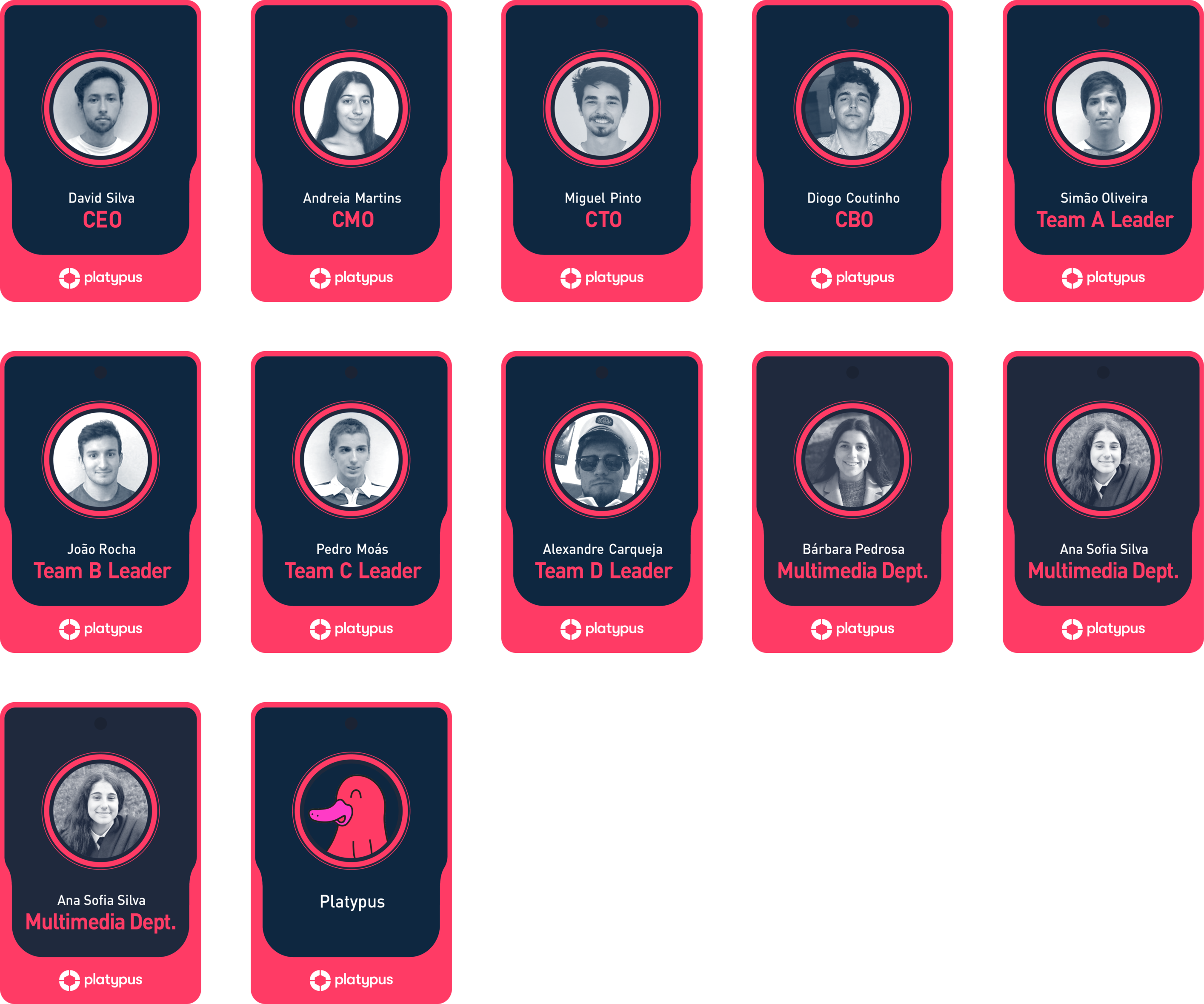
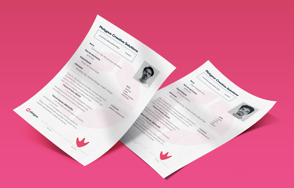
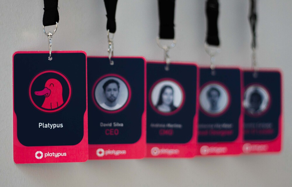
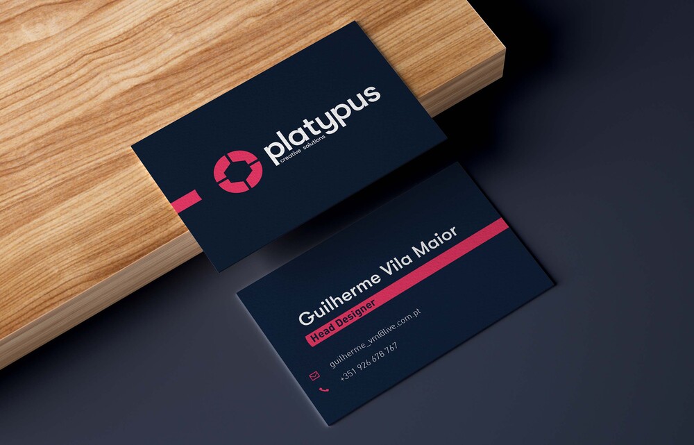
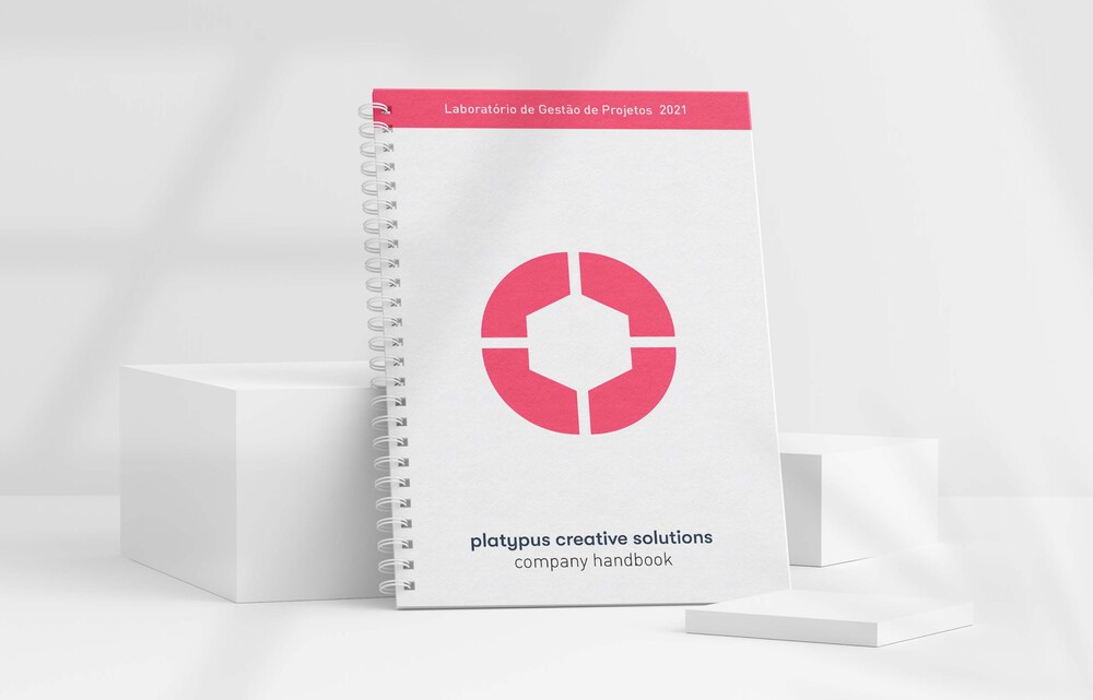
During my curricular internship, I worked within the Platypus Creative Solutions company, a start‑up company created in the Project Management Laboratory course at the Faculty of Engineering, University of Porto. As the company’s Head Designer, I developed the company's visual identity.
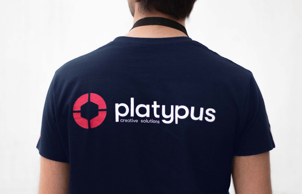
Logo
Concept
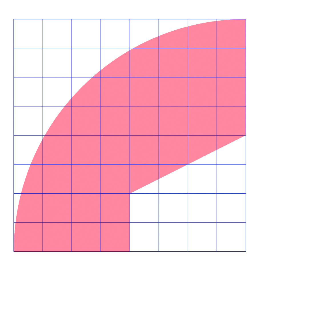
Through the side view of the Platypus' beak, you can find a small detail in shape of a 'P', that, through some transformations, originates what would be the essencial key for the final logo construction.
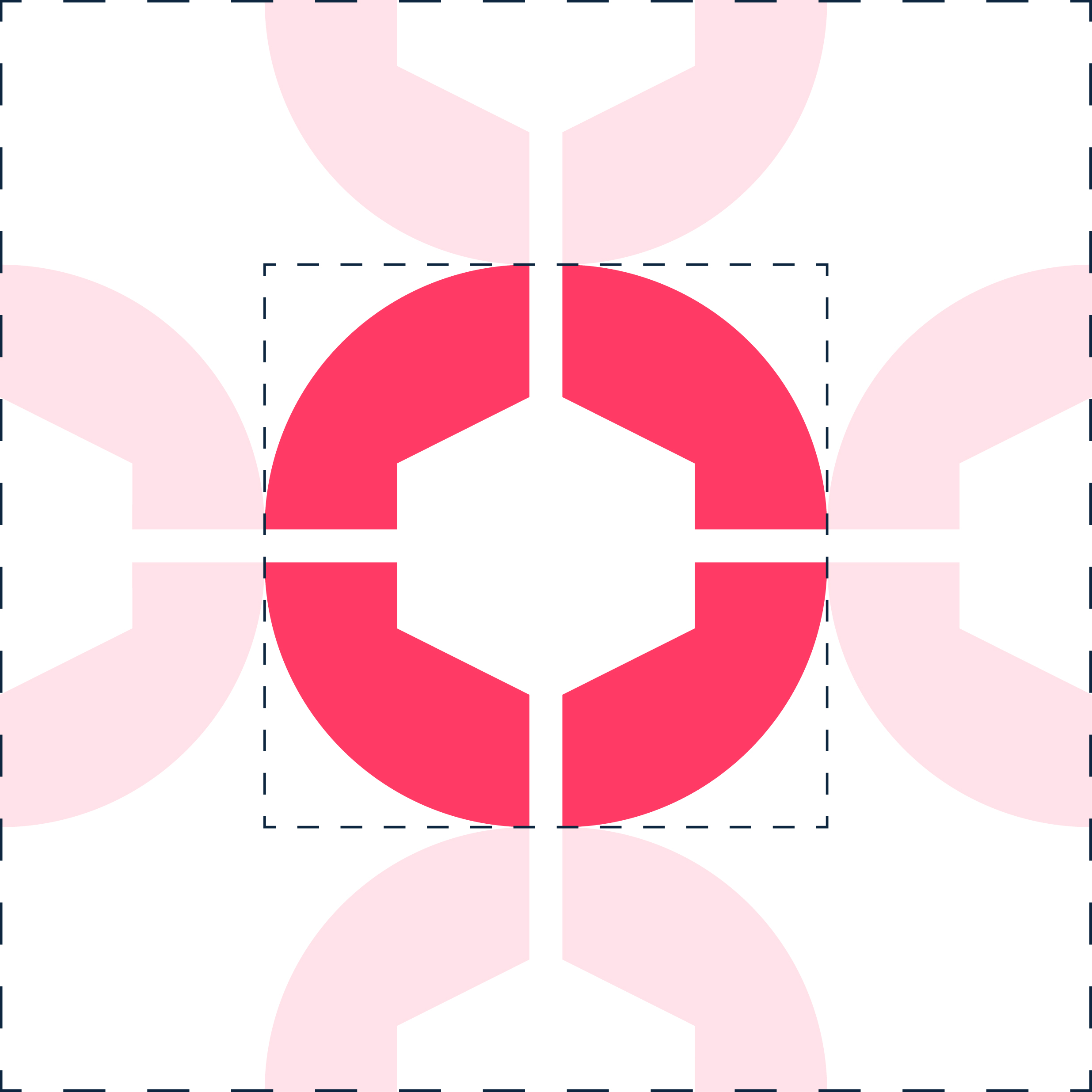
Grid
Taking this symbol and flipping it horizontally and vertically, making it 4 (representing the 4 teams that take part in the company), and rounding the edges, giving life to the final symbol.

Margins
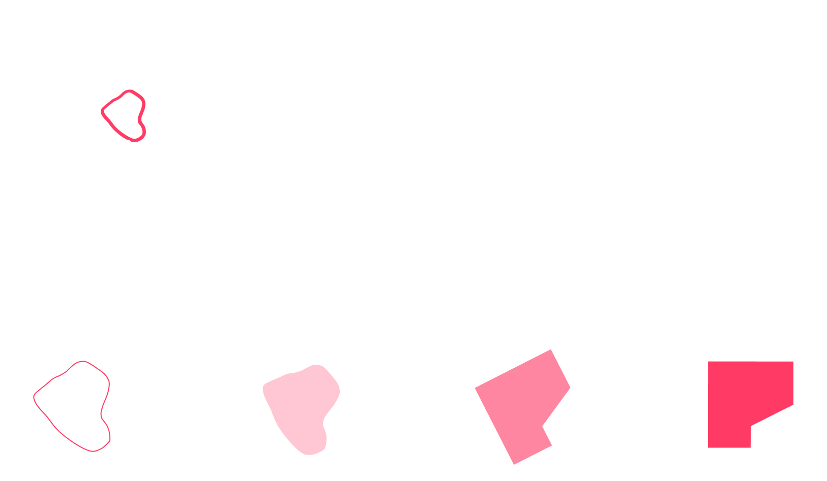
Colour Scheme

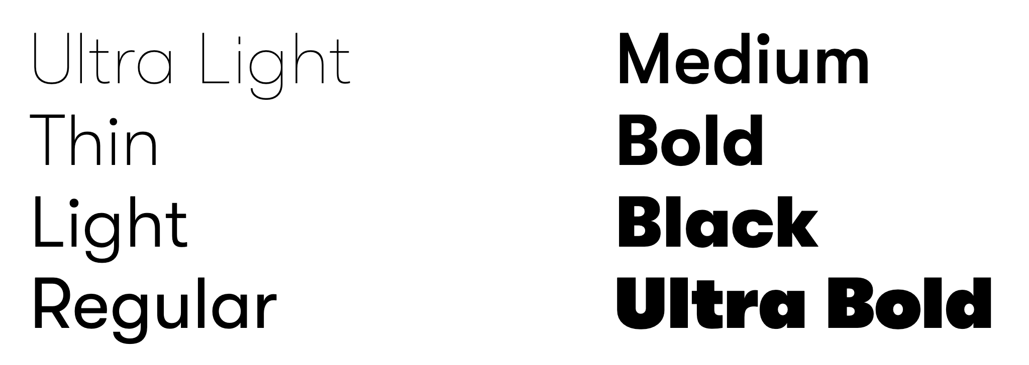
Typography
GT Walsheim Pro
The typography chosen for the logo was the sans serif font GT Walsheim Pro. This font goes for the logo, and for titles shared throughout social media, website and company documents.
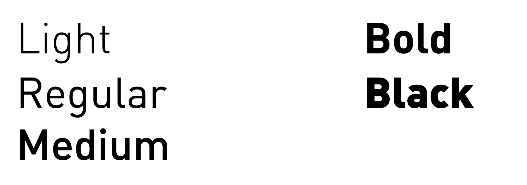
DIN
The typography chosen to complement the main font is DIN font. An also sans serif font, used for the rest of the text representing the visual aspect of the company’s written information, those being through website and social media text boxes, and also the documents’ text.
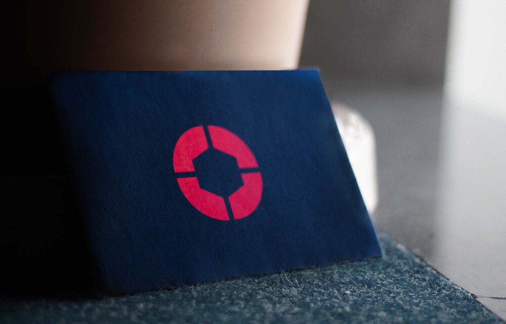
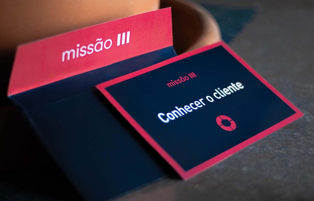
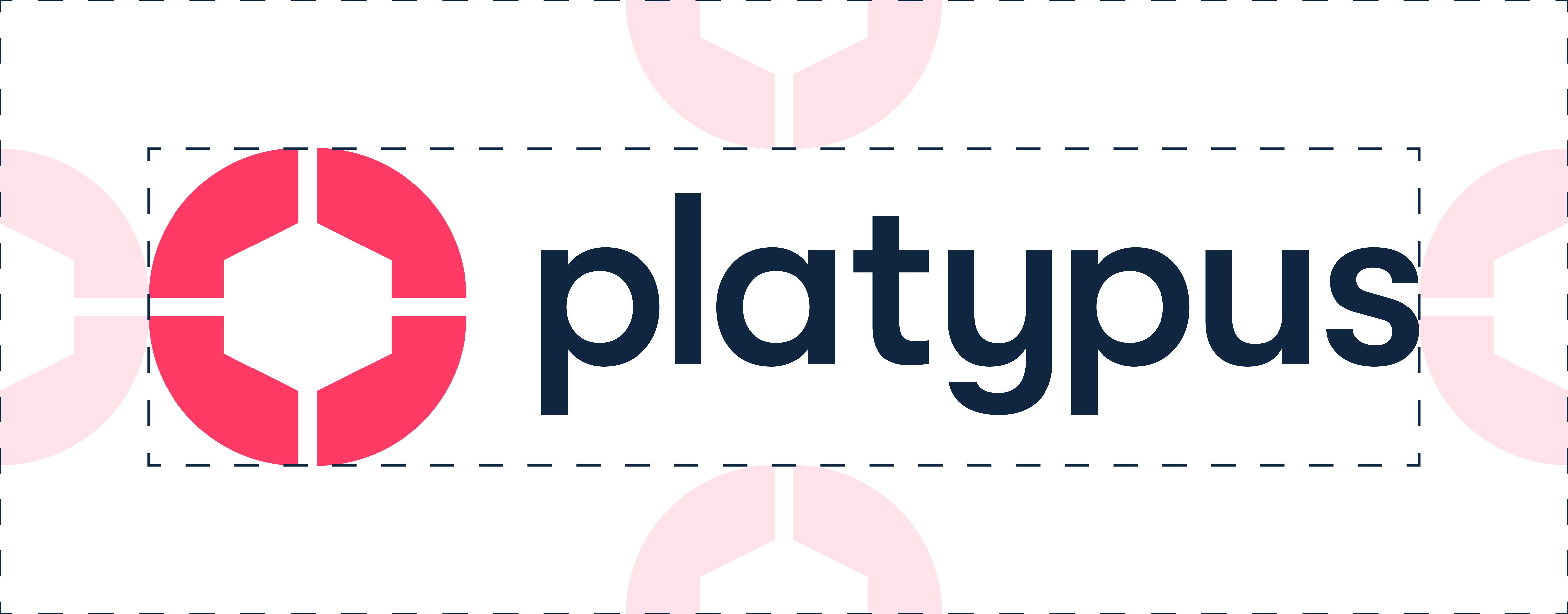
Logo Application