Erasmus+
February 2020 — June 2020Academic Project
Faculty of Fine Arts of University of Porto
Design Tools
- Adobe Illustrator
- Adobe Photoshop
- Adobe After Effects

Brand Guidelines

Logo
Concept
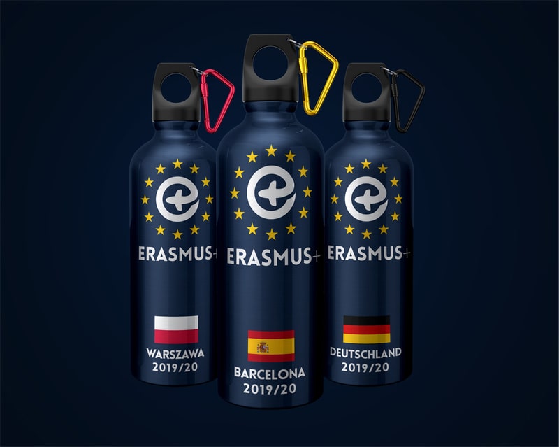
The Erasmus project serves to bring students and learning staff together, for those who share the love of learning, travelling and new experiences. The logo proposal for the brand consists on 3 elements (with 3 articulations). The main piece is the junction between the “e” and the stars, complementing it there is the “Erasmus+” written underneath.
The stars resemble the European foundation on the project, and come from the European Union flag, surrounding the white “e” element, this one coming from the union of an “e”, from “erasmus”, with a plus, in shape of an airplane to represent the internacionality and travelling of the project. To complete the logo, in a written form underneath, there is a written identification of the brand.

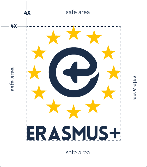
Grid

Margins


Colour Scheme
The colors for the brand revolve around 3 colors - white, gold and blue - the gold is from the flag’s stars, the blue is in a darker shade of the blue from the flag as well, and lastly the white for the “e” and “erasmus+” for ease of reading and make it pop. The logo can be placed on top of a variety of backgrounds, the colors of the logo may vary depending on the background, however, the stars should always remaing with their golden color (with only one exception), changing only the “e” and the “erasmus+”, switching between white and blue.


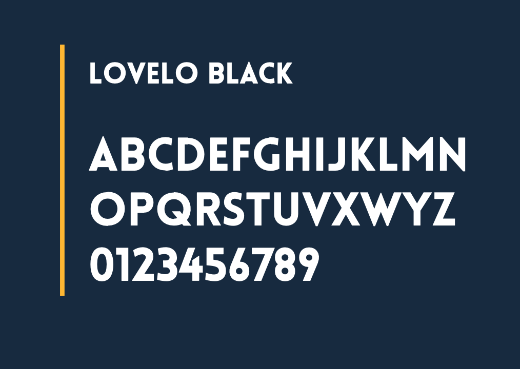
Typography
Lovelo
Qanelas

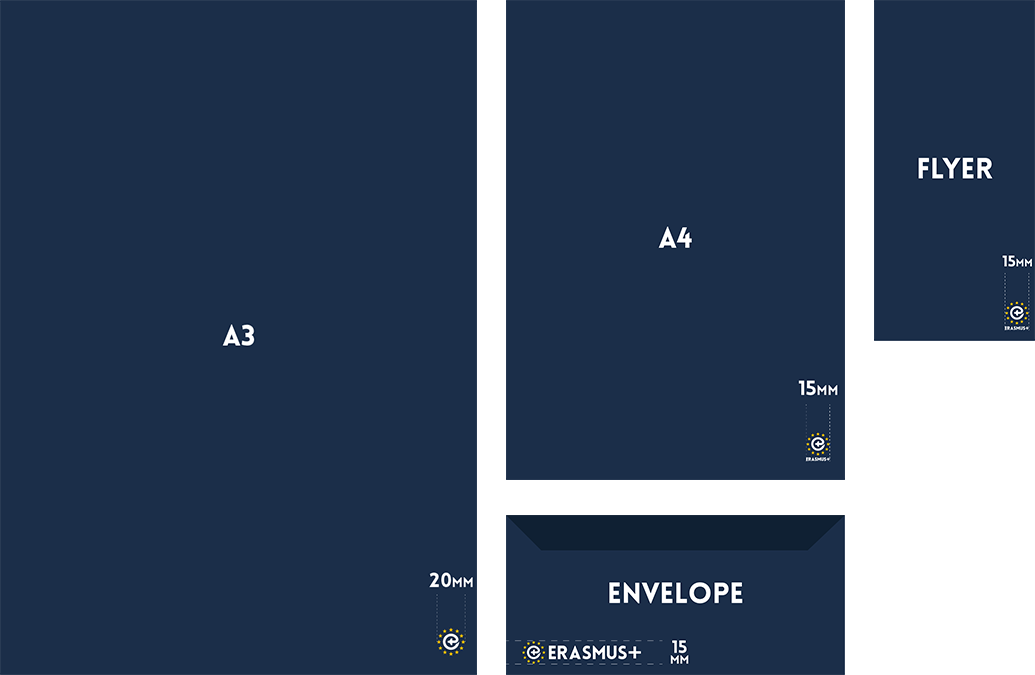
Printing Dimensions
Logo Application